Pace Prototype
Reducing Friction: One Screen at a Time
Looking at the original mockup for Pace’s single-screen onboarding prototype, it was a clear case of cognitive overload.
Too many words.
Too many input fields.
No cohesive brand voice.
Users were asked to digest everything at once, from personal details and permissions to goals and motivations.
My task: Make it simple.
Stretch the questions to multiple screens, reduce friction and make onboarding feel quick, motivating, and actually doable —without losing the key info Pace needed.
Apart from the mockup’s cognitive overload, the brand voice was nil—zero personality.
To align with the exercise and fitness domain, I defined Pace’s persona as motivational, goal-oriented, and professional.
Exercise can be hard for everyone, but tracking performance accurately with Pace at the user’s side can make all the difference.
Formulating Tone and Voice: Because the App Needs a Personality
Evolving Brand Colors: Exit Neutral Tones, Enter Vibrant Greens for Momentum
Time for a new palette. I followed my cardinal rule: I usually start with color to let it speak the brand vibe, but if necessary, voice and tone come first—then color amplifies the brand.
Keeping in line with the original mockup, I stayed within the green family but shifted to a vibrant neon green that captured the brand’s energetic and motivational spirit.
Streamlining Onboarding: From Endless Scrolling to Guided Steps
In a world where attention spans are basically extinct, it made sense to focus users on one question at a time by breaking onboarding into multiple screens.
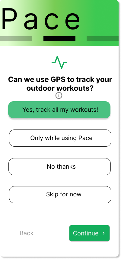
To enable personalized, trackable performance insights, Pace needs access to GPS data — sensitive stuff, I know.
No one enjoys unnecessary tracking, so I explain exactly how GPS powers accurate metrics and give users clear options to opt in comfortably.
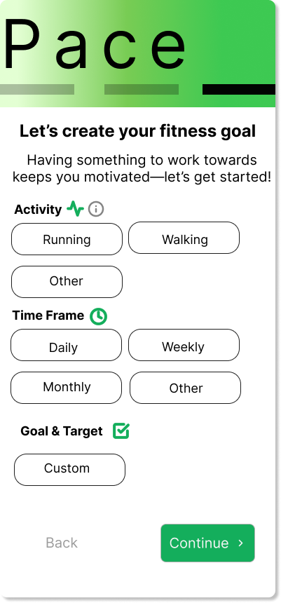
Refining Pace Onboarding Prototype: Move over Dense Screens — Make Way for Progressive Steps
Streamlining
Split questions across multiple screens → eases cognitive overload for users
Brand Voice & Tone
Defined brand voice and tone → created cohesive, trustworthy onboarding process
Color Scheme
Emotive green palette → evokes outdoors energy → motivates exercise
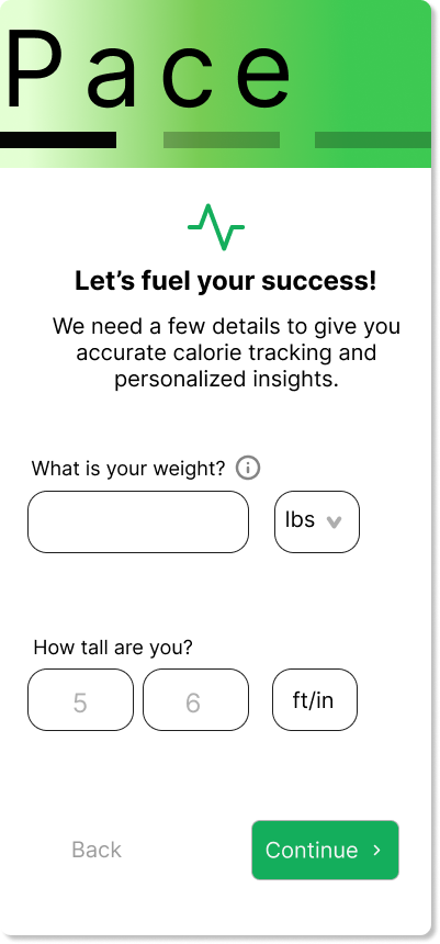
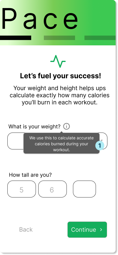

Weight Disclaimer → Helps users understand the purpose behind sensitive questions
1
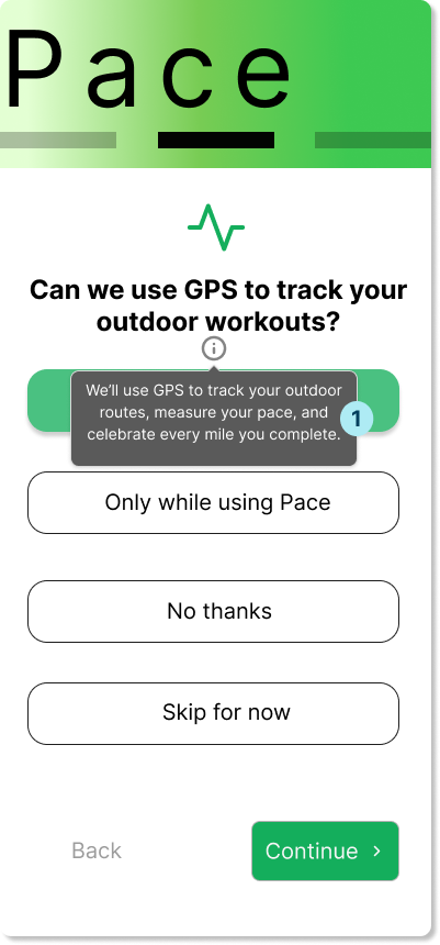
Clarifies benefits for tracking → reassures hesitant users
1

Warm subheader copy → Makes the last screen feel intuitive and energizing
1
2
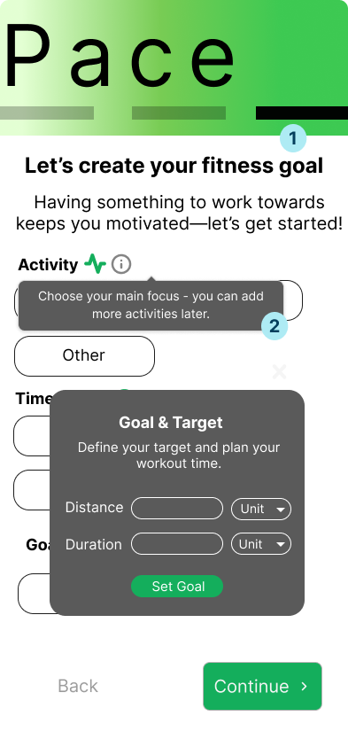
Tooltip guidance → Lowers hesitation: ‘Add more later’ eases single-choice pressure
Personalized input modal → Supports custom workouts + inline guidance to avoid errors
3
Prioritizing Intuitiveness: Screens Users Actually Understand (and Complete)
Customizable Yet Simple
When I started prototyping this feature, I knew I had to come up with a way to make the onboarding customizable without losing simplicity.
The product needed several key questions for performance tracking, but the flow and wording had to feel effortless and intuitive.
Intuitiveness Above all Else
That was the key realization:
If I—the designer with full context—still found it unclear, a first-time user would almost certainly get stuck too. This drove home a principle I’ll now prioritize—intuitiveness comes before everything else.
Confusion Remained
I separated the questions across multiple screens with clear, concise prompts and logical grouping.
The structure worked well overall—except for one question that remained stubbornly confusing.
Layered Overlays For Better Fit
I also learned that user-friendly design requires a range of overlay patterns.
Moving forward, I'll incorporate: modals for focused, high-priority tasks; tooltips for lightweight guidance; and popovers for contextual, non-disruptive help—always choosing the one that best matches the user's mental image and flow.