Blend&Bean Prototype
Crafting 404 Page Experience: It’s like asking “How does that Make You Feel?”
You’re about to buy your coffee subscription, and you get the dreaded page. 404 page not found. Just that. No explanation. No redirect. Just a blank white screen with font straight out of 1995.
Taking this annoyance into consideration, I created a 404 page for Blend& Bean that injects lightness while steering the user back to researching and purchasing a coffee subscription.
Hitting that Sweet Spot: Iteration after Iteration
I thought of one version. It was too unprofessional.
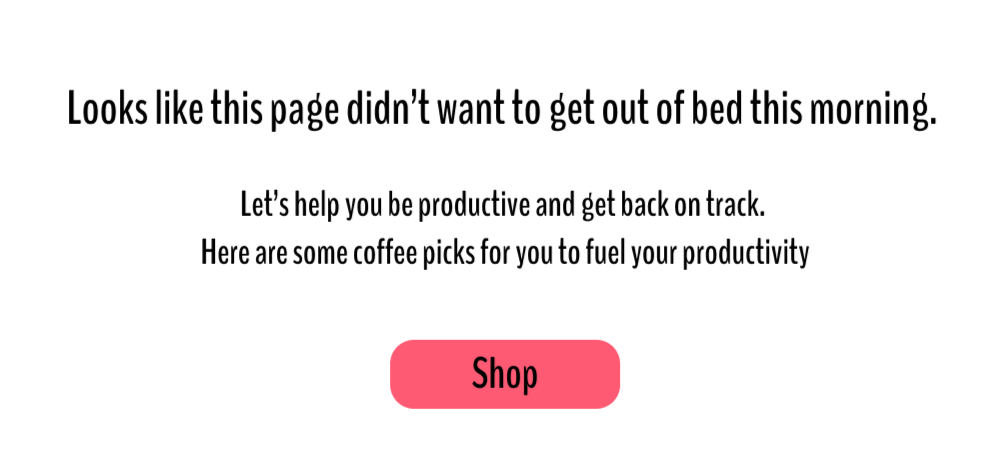
I tried the next.
Too bland.
Try number three. Not the tone I was going for.
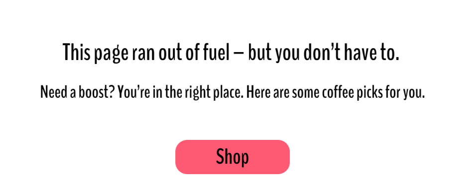
I stepped back to basics: What actually defines Blend&Bean? A coffee brand that turns routine sips into something exciting — bucket-list energy in every cup.
So why not lean into that? After digging into daring adventures, the copy finally felt right:
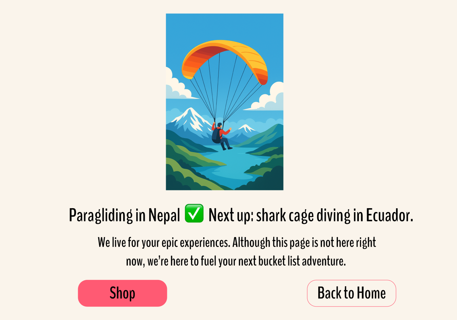
“Paragliding in Nepal ✅ Next up: shark cage diving in Ecuador.” We live for your epic experiences. Although this page is not here right now, we’re here to fuel your next bucket list adventure.
Choosing the Perfect Visual: It’s Not Just a Pretty Picture
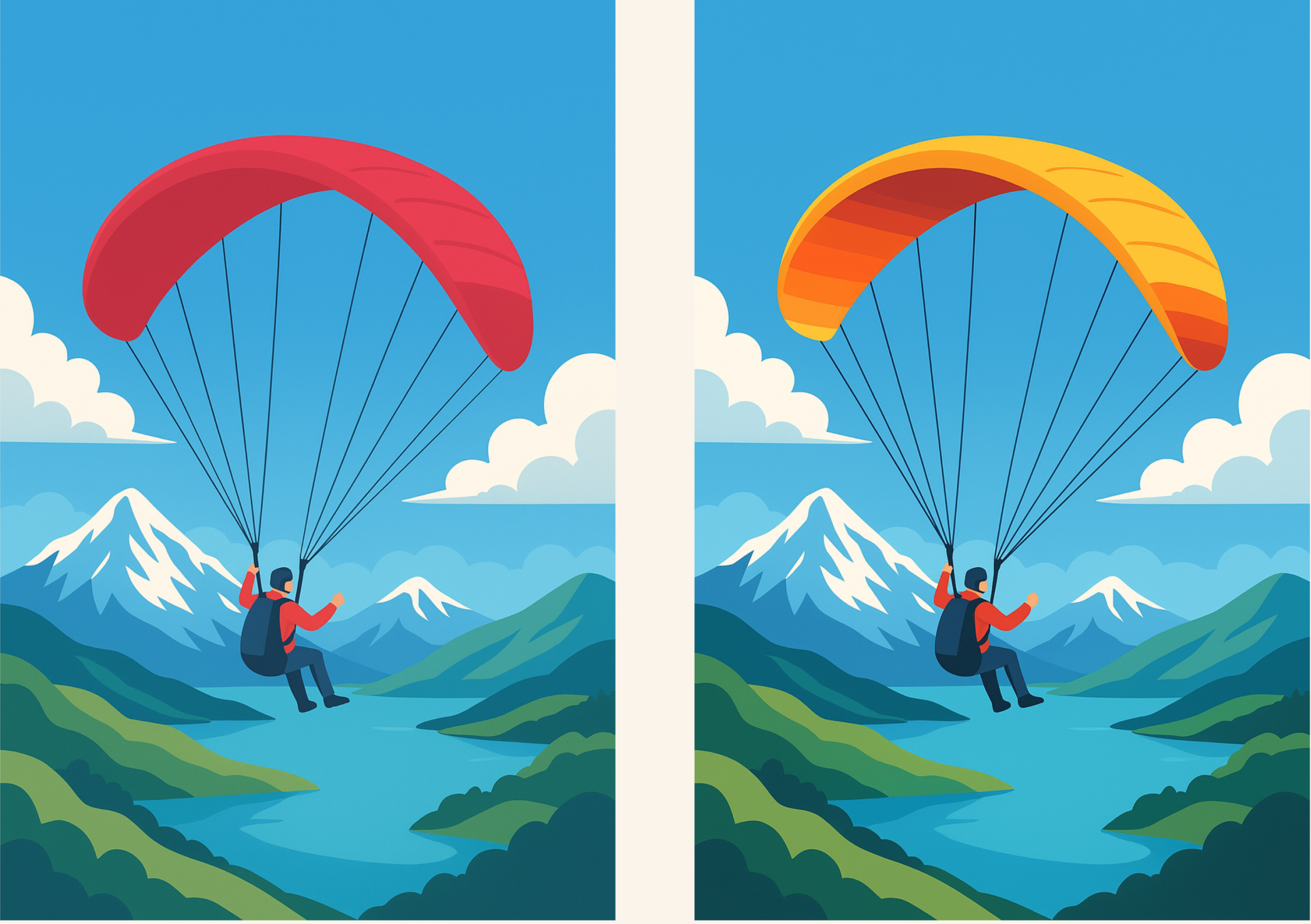
Bucket-list adventure needed an exotic hero image. Paragliding over a dramatic landscape checked the boxes.
As the image generated, I stuck to my cardinal rule: colors express the brand vibe.
Obviously, because of the brand color, coral all the way. Yet Claude (by Anthropic) decided it knew better — golden yellow paraglider incoming.
Skeptical, I prompted a coral version for side-by-side comparison.
Surprise: the golden yellow popped bolder, more assertive — a perfect match for Blend&Bean’s energetic, adventurous spirit.
Achieving Design Outcomes: Memorable, Effective, and Brand-Alignment
Used adventurous bucket-list-themed copy → perfectly echoes our bold, personable, yet professional brand voice to transform error into memorable engagement.
Added ‘Main Page’ CTA → allows multiple pathways for users to get back on track
Utilized green check icon next to completed adventure → evokes a satisfying 'job well done' feeling to counter frustration and keep the energy positive.
Reimagining 404 Graphics: Breaking Out of My Comfort Colors for Bold Impact
Color=Vibe
When designing mockups, my personal rule: color comes first.
I believe it establishes the emotional tone and vibe before users even process the copy — especially crucial for a 404 page, where the goal is to soften frustration and keep visitors engaged.
Early prototype
Safe, familiar colors all the way. Yet when it mattered, I had to break out of my comfort zone.
Side-by-side comparison? The bolder choice made the whole page come alive — playful, refreshing, fully on-brand — even though it strayed from my starting palette.
Key takeaway
Don’t default to comfort. Bolder, less predictable moves — even on small details — can deliver a stronger emotional punch and better UX. It’s a reminder that solid process needs room for calculated risks when the result clearly wins.