The Resin Factor by M.S. Designs
Keeping it Simple: Booking a Workshop Shouldn’t Feel Like a Puzzle
M.S. Designs has a unique business approach, so I redesigned their resin workshop booking flow to match.
To book a resin experience, users must contact M.S. Designs first — no deposit can be placed until a time is agreed upon.
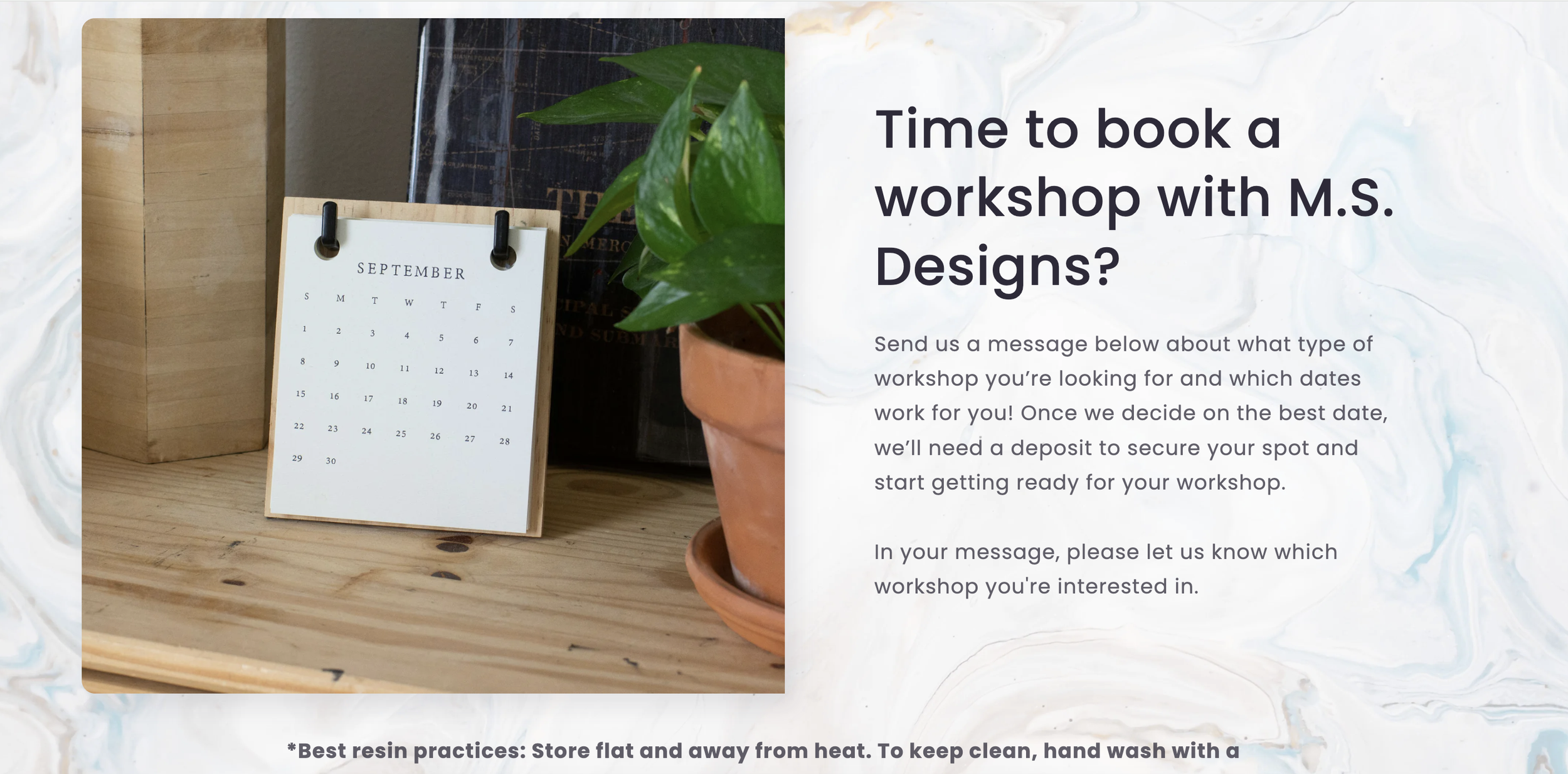
The original hero copy was anything but hero-like.

Confusing instructions everywhere, and redundancy. As if one or two CTAs weren’t enough, there were three. Nothing prevented a customer from dropping a deposit and assuming the workshop was locked in — regardless of time, place, or actual availability.
Original text but not in it original format
The repetitive noise had to go. I restructured the flow to guide progressively: clear steps that ensure users reach out before payment options even appear.
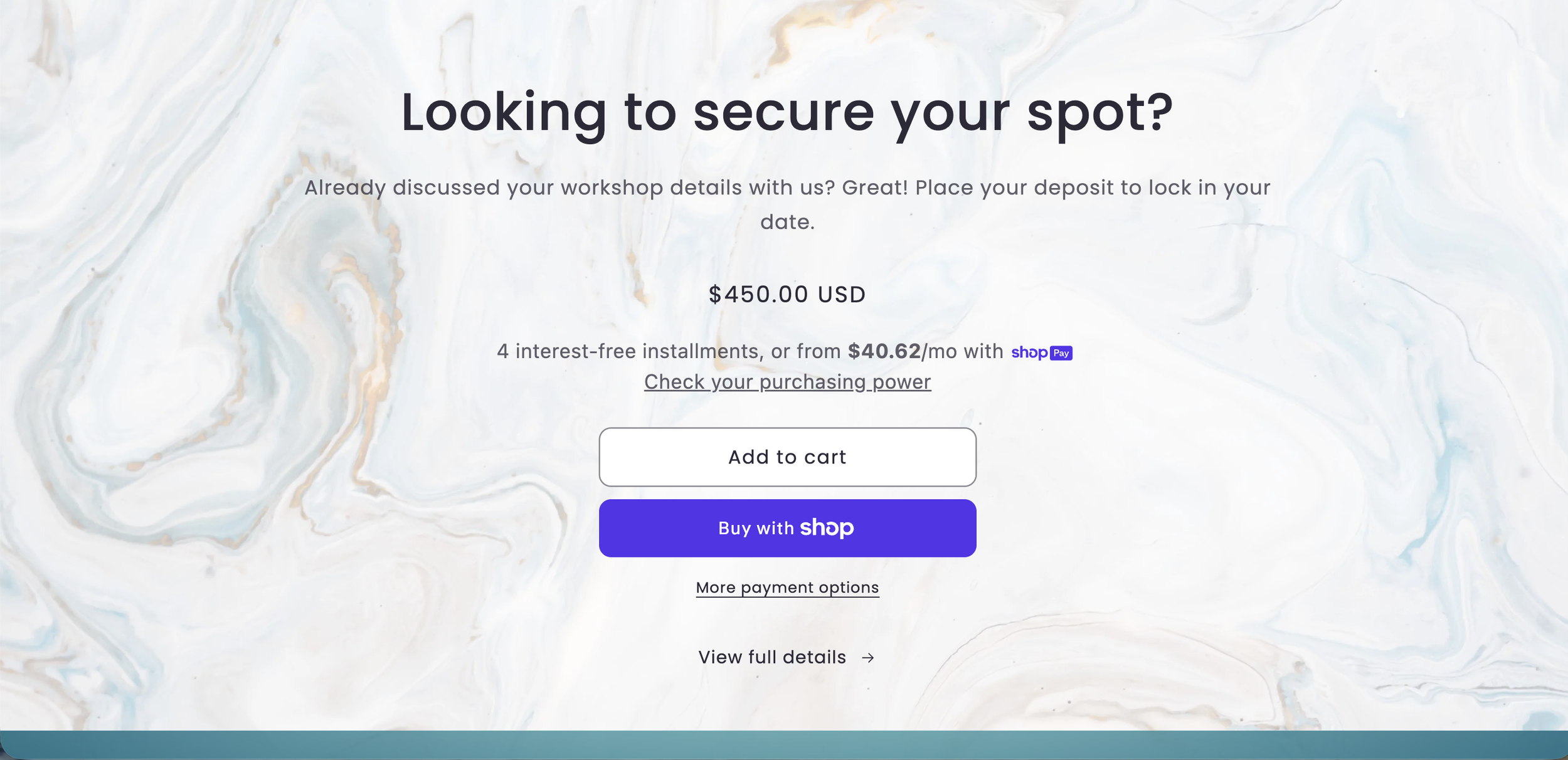
Dividing the Page: Scheduling at the Top, Deposits at the Bottom
Keeping it straightforward, I divided the page into clear sections — one part of the flow at a time.
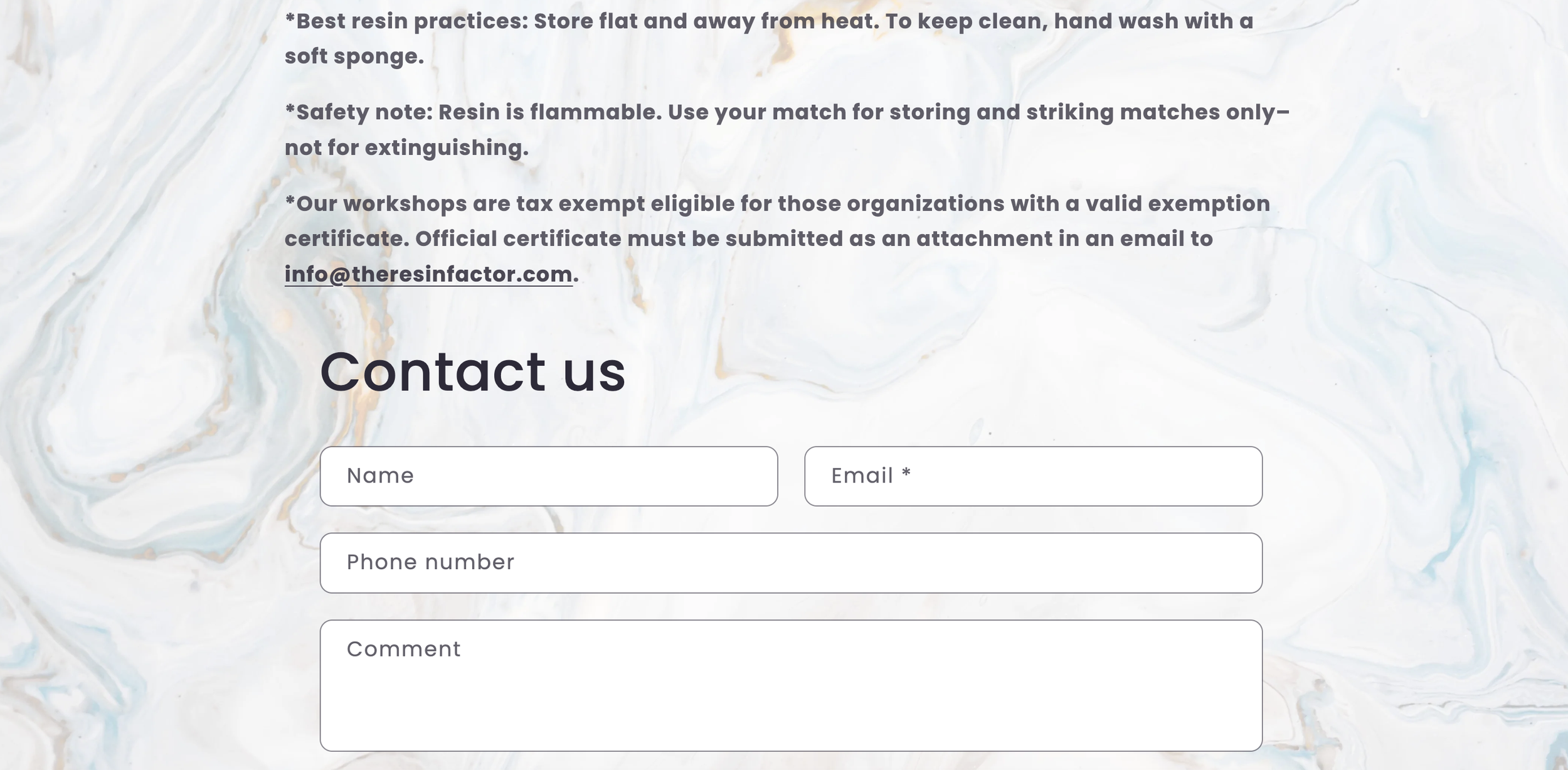
Top half: scheduling the workshop and a prominent contact form. The message is simple: reach out first, book later.
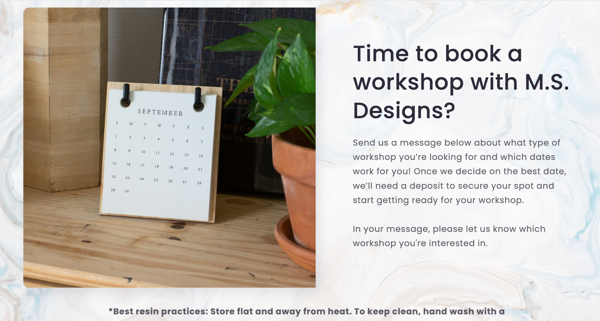
Bottom half: payment, reduced from three competing CTAs to one clean “Place Deposit” button. No more guessing between traveling fee or base fee — payment only appears after contact, so customers arrive informed, agreed on details, and actually ready to commit.

Achieving Design Goals: Because Who Says You Can’t Book a Workshop Easily?
Streamlining
Streamlined booking → clear 'contact first' guidance prevents premature deposits
Tailor Made
Tailored to business model → contact-first hero reduces deposit errors
Single CTA
Focused single CTA → clearer payment path, less user confusion
Approachable brand voice in hero → builds instant user comfort

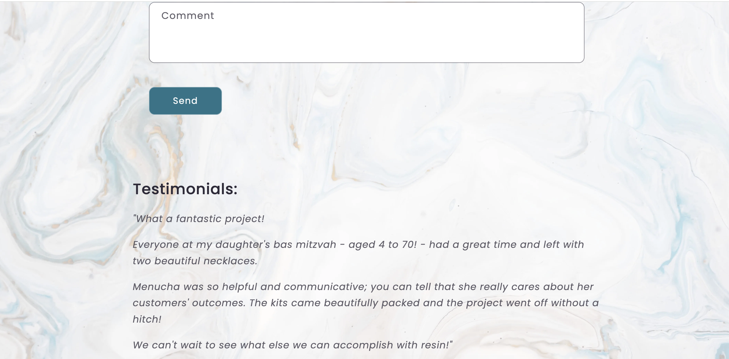
Placed testimonials pre-contact form → motivates users to reach out
Added friction subheader → ensures contact before payment commitment

Reflecting on Site Copy: Embracing Client Input for Stronger Collaboration
Collaboration is Key
Especially with the client. While writing extensive copy for this project, I was protective of the brand voice I’d carefully shaped. The client, naturally, had different preferences.
Took Me Long Enough
After several rounds of back-and-forth, the realization hit: the client needs to feel genuine ownership and satisfaction in the final product.
The revised wording still conveyed the core message clearly — the differences weren’t structural to the design system.
The Need for Flexibility
This reinforced an important balance: a strong rationale for my choices matters, but so does flexibility.
Embracing their perspective ultimately strengthened the collaboration and delivered a seamless, cohesive site.